When designing a kitchen, it’s often the finer details that elevate the space from functional to unforgettable. Cabinet handles, tapware, and lighting might seem like separate decisions at first – but when thoughtfully aligned, they create a cohesive and highly considered finish.
One of the most impactful ways to achieve that cohesion is by carefully selecting your pendant lights to complement your kitchen hardware and tapware. These elements sit at eye level, catch natural and artificial light, and subtly define the tone of the entire room. Get them working together, and your kitchen instantly feels intentional and refined.
Here’s how to approach the process with clarity and confidence.
Start with the Finish: Unifying Metal Tones
The simplest way to create harmony between pendant lighting, hardware, and tapware is through finish selection.
-
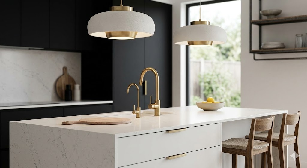
Match Exactly for a Seamless Look
If your kitchen features brushed brass handles and a brushed brass mixer tap, choosing pendant lights in the same finish creates visual continuity. This approach works particularly well in contemporary and minimalist kitchens where consistency is key. The result? A clean, polished aesthetic that feels calm and curated.
-
Coordinate – Don’t Copy
Matching doesn’t always mean identical. For example:
-
Brushed nickel tapware pairs beautifully with satin chrome pendants
-
Matte black handles can complement black-framed or powder-coated pendant lights
-
Aged brass hardware can work alongside warm bronze lighting
The goal is to keep undertones aligned. Warm metals (brass, bronze, copper) work best together, while cool metals (chrome, nickel, stainless steel) naturally harmonise.
Consider the Kitchen Style First
Before locking in finishes, step back and consider the overall design direction of your kitchen.
-
Modern & Minimalist:Opt for streamlined pendant lights with clean lines and simple silhouettes. Matte black, brushed nickel, or soft brass finishes pair well with handle-less cabinetry or slimline hardware.
-
Coastal or Hamptons:Polished chrome, white glass, and soft metallics complement shaker cabinetry and classic tapware. Glass pendant shades can also add lightness without overwhelming the space.
-
Industrial:Matte black, aged brass, or raw metallic finishes tie in beautifully with exposed hardware and bold tapware. Statement pendants with visible bulbs can reinforce the aesthetic.
-
Contemporary Luxe:If your tapware and handles lean toward brushed gold or bronze, sculptural pendant lights in a similar tone can become a stunning focal point above the island.
When lighting reflects the broader design language of the kitchen, everything feels connected.
Balance Proportion and Placement
Matching finishes is only half the equation. Scale and placement matter just as much. If your hardware is bold and chunky, delicate pendant lights may feel disconnected. Conversely, oversized pendants can overwhelm slimline handles and minimalist tapware. Ask yourself:
-
Is the kitchen island large enough to support two or three statement pendants?
-
Are the handles subtle enough to allow lighting to take centre stage?
-
Does the tapware feature a strong design detail (such as a curved gooseneck or square profile) that can be echoed in the lighting shape?
Repeating shapes – curves with curves, straight lines with straight lines – subtly strengthens visual cohesion.
Mix Materials with Intention
Not every element needs to be metallic. In fact, layering materials often adds depth and character. For example:
-
Timber or rattan pendant shades can soften kitchens with bold black tapware.
-
Glass pendants can lighten a space dominated by heavy brass hardware.
-
Stone or ceramic finishes can add texture alongside sleek stainless steel taps.
The key is ensuring there’s at least one connecting thread – whether that’s colour temperature, undertone, or form.
Pay Attention to Light Temperature
While it’s not visible as a “finish”, light temperature dramatically impacts how metals appear. Warm white lighting (around 2700K–3000K) enhances brass, bronze, and timber tones. Cooler white lighting can make chrome and stainless steel appear crisp and clean. If your tapware has a warm finish but your pendant lights emit a cool tone, the mismatch can feel subtle yet unsettling. Always consider how the bulb choice supports your chosen materials.
Decide on a Hero
Not every element needs equal attention. Sometimes the best approach is choosing one standout feature and allowing the others to support it.
-
If your tapware is sculptural and bold, opt for refined, understated pendants.
-
If your pendant lights are oversized and dramatic, keep hardware simple.
-
If cabinetry handles are a design feature, ensure lighting enhances rather than competes.
A clear hierarchy prevents visual clutter and creates a more sophisticated outcome.
When in Doubt, Create Contrast
While matching finishes is a safe strategy, deliberate contrast can be equally striking. Black pendant lights paired with brass tapware can create modern edge. White glass pendants above dark hardware can add softness and dimension. The trick is ensuring the contrast feels intentional, not accidental. Repeat the contrasting finish elsewhere in the room – perhaps in appliances, stools, or decorative accents – to tie it all together.
Matching pendant lights with kitchen hardware and tapware isn’t about rigid rules… it’s about alignment, balance, and thoughtful repetition
When finishes complement each other, shapes echo subtly, and proportions feel right, your kitchen moves beyond functionality into refined design. The result is a space that feels cohesive, welcoming, and carefully curated – without appearing overly styled. Whether you’re renovating from scratch or updating key features, taking the time to coordinate these details ensures your kitchen lighting doesn’t just illuminate the room – it elevates it.