
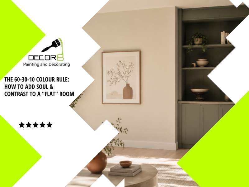
Key Insights (At a Glance)
- The Formula: The 60-30-10 rule breaks down a room's palette into 60% dominant base, 30% secondary structure, and 10% contrast accent.
- The Problem: Painting an entire room in a single flat shade removes shadow and light reflection, leaving spaces looking sterile, cold, and washed out in photos.
- Quick High-Impact Upgrades: You don't need a total renovation. Darkening doors or architraves by two shades, painting a recessed media nook, or adding a rich feature arch delivers instant depth.
- Why Prep Matters: High-contrast accent colors highlight wall imperfections. Meticulous filling, sanding, and priming are mandatory before applying bold paint.
Have you ever looked around a freshly painted room in your home and felt like something was missing? The walls are clean, the coat is fresh, but the overall feel is sterile, clinical, or completely flat on camera.
You aren't alone. One of the most common mistakes Sydney homeowners make during an interior repaint is using a single, uniform shade across every wall, door, and skirting board. Without tonal variation, natural sunlight has nothing to bounce off, eliminating visual depth and making even spacious open-plan homes feel uninspired.
Before diving into paint swatches or calculating your project budget with our 2026 Sydney House Painting Cost Guide, it pays to understand the secret interior designers use to build visual warmth: The 60-30-10 Colour Rule.
What is the 60-30-10 Paint Rule?
The 60-30-10 rule is a decorating proportion ratio that balances three distinct shades to create a room that feels cohesive yet full of personality:
1. The 60% — Your Dominant Base (The Anchor)
This forms the background canvas of your space, covering roughly 60% of the room (primarily your main living room or hallway walls).
2026 Sydney Trend: Move away from cold, stark hospital whites and outdated clinical greys. Modern Sydney interiors favor warm off-whites, creamy greige, or soft stone tones that amplify natural light while keeping the space cozy.
2. The 30% — Your Secondary Shade (The Structure)
The secondary colour provides structure and prevents visual monotony. It should be distinct enough from your base coat to create soft contrast.
- Where to apply it: Internal doors, architraves, window frames, kitchen cabinetry, built-in joinery, or an architectural feature wall.
- Colour ideas: Soft sage green, warm taupe, muted slate, or natural timber stains.
3. The 10% — Your Pop of Contrast (The Soul)
This is the magic accent that brings a flat room to life. That final 10% pulls the eye toward key focal points and ties the room's decor together.
Where to apply it: A painted entryway nook, a feature archway, a bold vanity, or high-contrast decor like artwork, throw cushions, and metallic fixtures.
3 Easy Ways to Add Contrast to Your Sydney Home
If your home currently suffers from "one-colour syndrome," you don't need a massive structural overhaul. Strategic placement of contrast paint can transform your space:
1. Contrast Architraves & Doors
Instead of painting all doors and architraves in standard high-gloss white, consider dropping them two shades darker than your main walls. A warm greige or subtle charcoal door against a soft warm wall instantly grounds a hallway.
2. Highlight Architectural Features
Got a chimney breast, a recessed TV nook, or a hallway arch in your Hills District or Blue Mountains property? Painting just that recessed section in a deep, earthy tone creates a stylish focal point that breaks up massive open-plan areas.
3. Pair Crisp Trim with Soft Feature Walls
Combining soft wall shades (like muted terracotta or sage) with sharp, ultra-clean white trim gives every doorway and window frame a clean, tailored finish. Explore our full range of professional interior painting services to see how custom trim work elevates residential spaces.
Pro Tip: Why Preparation Matters for Contrast Colors
Dark contrast shades and rich accent paints show every single wall defect if surface prep is rushed. Deep paints reflect light differently, meaning cracks, uneven plaster, and poorly sanded patches will stand out immediately. A lasting, flawless finish always begins with thorough washing, crack filling, fine sanding, and proper priming.
Skip the Colour Stress with Decor8
Trying to pick three colours that harmonize under Sydney’s unique natural light can feel overwhelming. Colour swatches under store fluorescent lighting rarely match how paint cures inside your living room.
At Decor8, we eliminate the stress of interior transformations:
- Personalized Guidance: Every full interior painting project includes on-site colour advice directly with John.
- Climate-Durable Paints: We use premium, low-VOC Dulux paint systems formulated to withstand Sydney's weather conditions.
- Flawless Finish, Zero Drama: From thorough patching and drop-sheet protection to razor-sharp lines along every skirting board.
Frequently Asked Questions (FAQ)
Q: What is the 60-30-10 rule in interior painting?
A: The 60-30-10 rule is a design ratio used to balance paint colours in a room. 60% of the space is your main wall colour (base), 30% is a secondary tone used on trim, doors, or feature walls, and 10% is an accent colour used for bold contrast.
Q: Can I use the 60-30-10 rule if I want white walls?
A: Absolutely. You can use a warm off-white as your 60% base, a deeper greige or warm taupe on your doors and trim for the 30% secondary shade, and introduce bold artwork, dark cabinetry, or a painted feature nook for your 10% contrast accent.
Q: Are feature walls still in style in Sydney for 2026?
A: Yes, but the style has evolved. High-gloss, harsh accent walls are out. Modern 2026 trends focus on subtle texture, warm earthy neutrals, painted architectural arches, or dark-toned recessed nooks that add depth without overpowering the home.
Ready to Give Your Home Genuine Depth & Soul?
Stop guessing with paint swatches. Click Here to Schedule Your Free On-Site Consultation & Quote across the Hills District, Western Sydney, and the Blue Mountains.